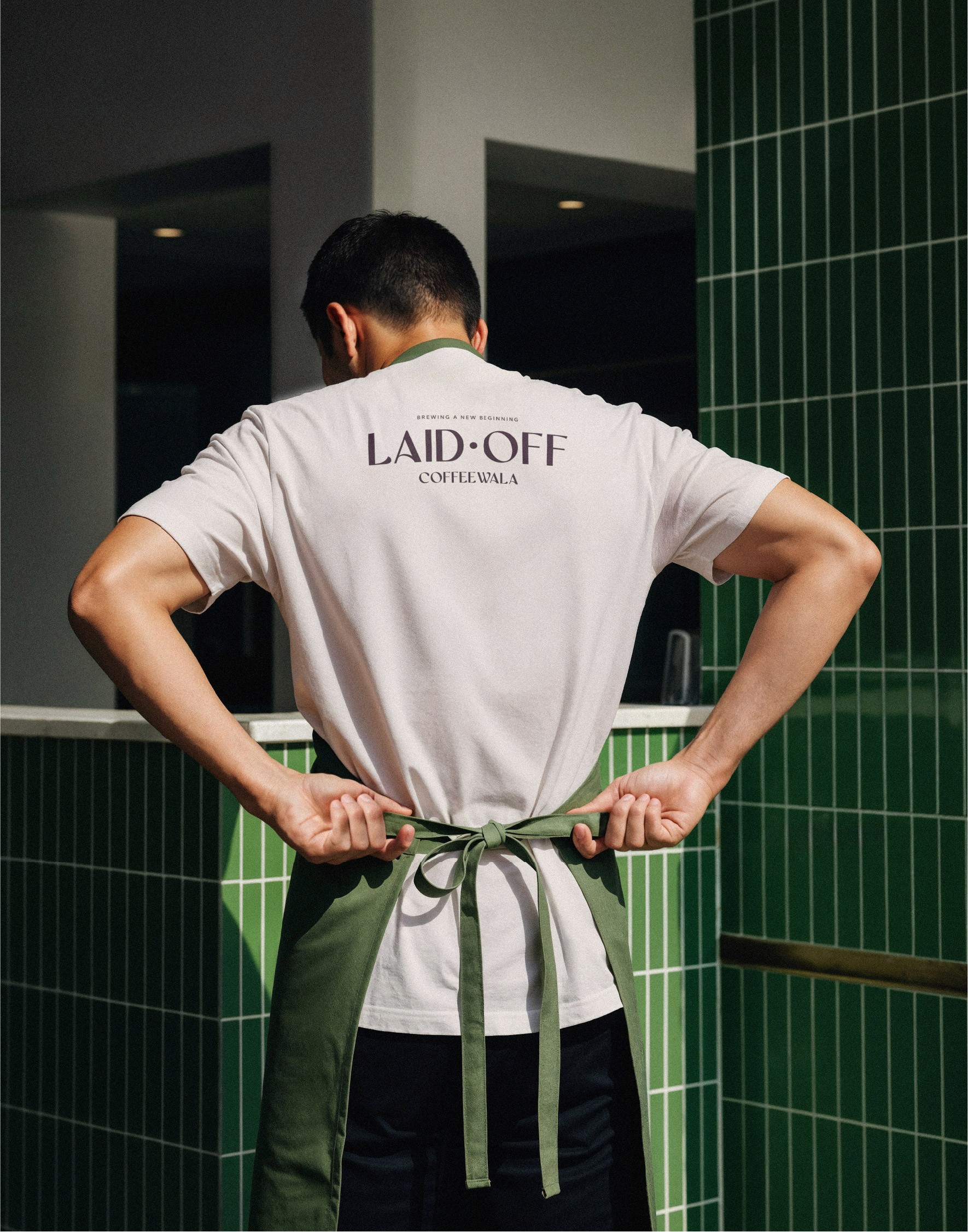
Laid Off Coffeewala
Laid Off Coffeewala
Laid Off Coffeewala
Coffee built for the recently realigned.
A brand that turns layoffs, burnout, and boardroom jargon into ritual and release.
Coffee built for the recently realigned.
A brand that turns layoffs, burnout, and boardroom jargon into ritual and release.
Coffee built for the recently realigned.
A brand that turns layoffs, burnout, and boardroom jargon into ritual and release.

Locale
FREMONT, CALIFORNIA
FREMONT, CALIFORNIA
FREMONT, CALIFORNIA
Client
LAID OFF PARTNERS
LAID OFF PARTNERS
LAID OFF PARTNERS
Category
BRAND IDENTITY & CULTURAL COMMENTARY
BRAND IDENTITY & CULTURAL COMMENTARY
BRAND IDENTITY & CULTURAL COMMENTARY
Duration
Duration
8 weeks
8 weeks
8 weeks
strategy
strategy
Laid Off Coffeewala was built as cultural commentary disguised as a coffee brand. The goal was to capture the post-layoff corporate psyche and translate shared burnout into something tangible. It needed to feel painfully accurate, socially aware, and commercially viable at the same time.
Laid Off Coffeewala was built as cultural commentary disguised as a coffee brand. The goal was to capture the post-layoff corporate psyche and translate shared burnout into something tangible. It needed to feel painfully accurate, socially aware, and commercially viable at the same time.
CONCEPT
CONCEPT
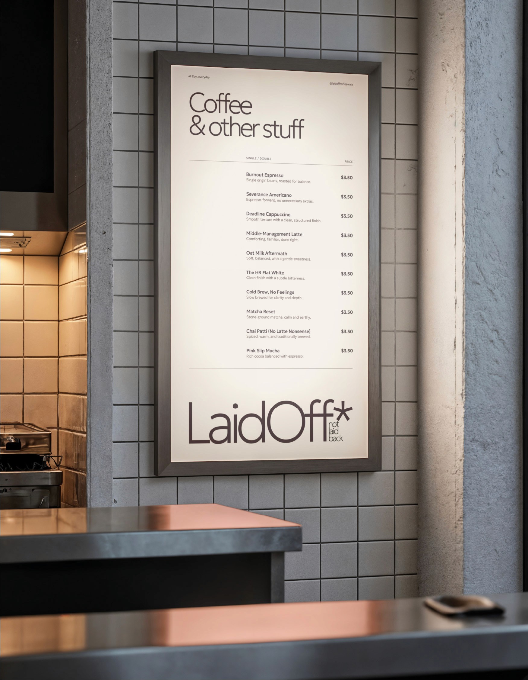
The brand speaks in corporate language and flips it. Performance reviews, shareholder value, AI scapegoats, wellness webinars, and forced positivity become copy lines.
“Got laid off, but…” emerges as a recurring narrative device, not the entire identity, but a powerful campaign mechanic. Satire that reflects reality so closely it becomes uncomfortable.


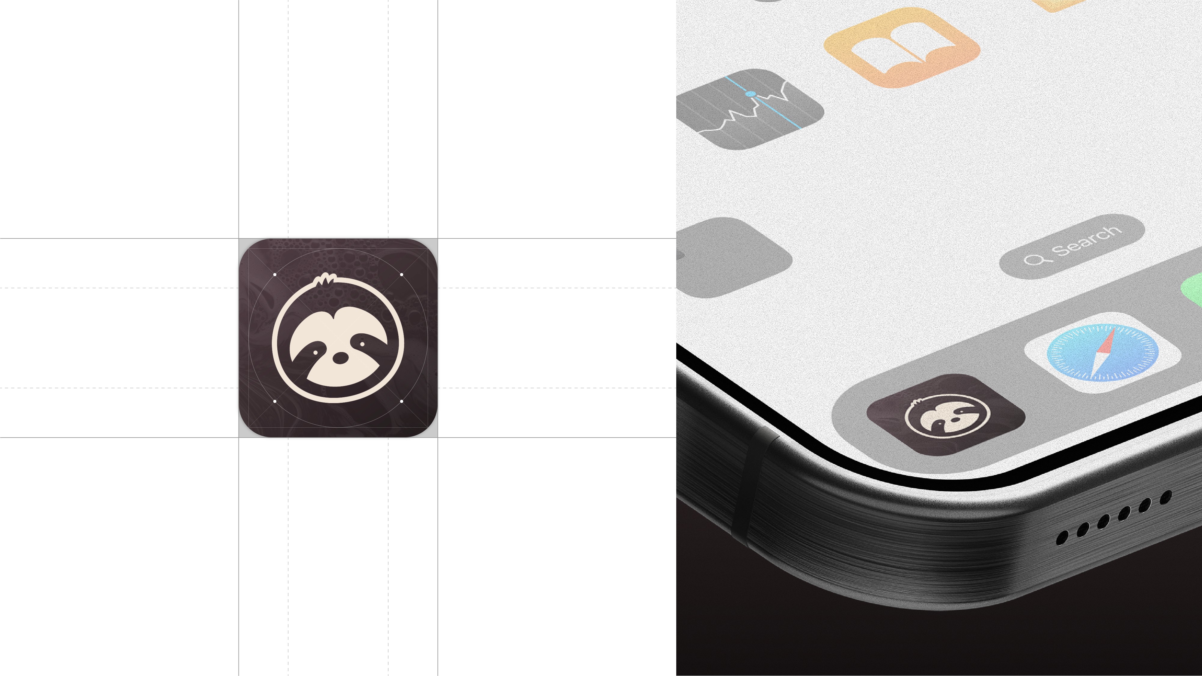
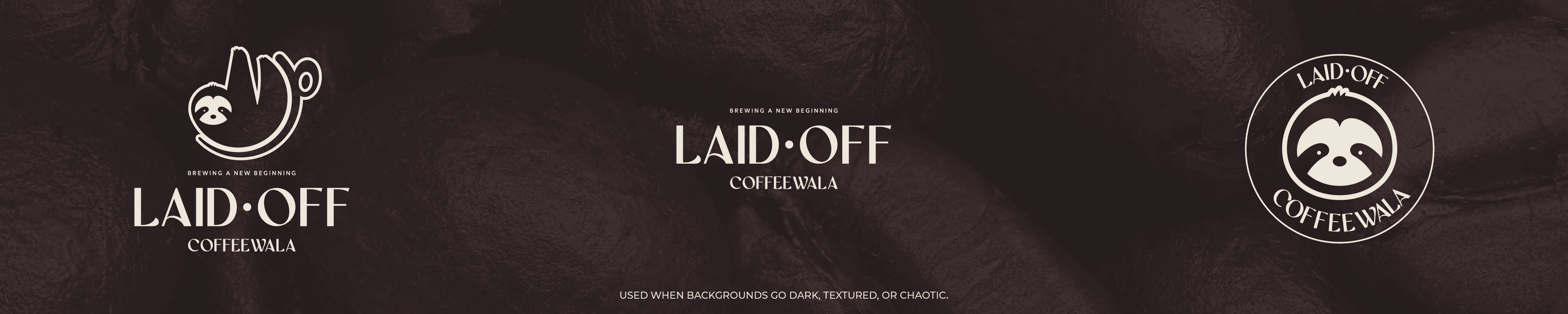

Identity System
Identity System
The palette leans into muted corporate fatigue: Burnout Brown, Severance Beige, Oat Milk Aftermath. Typography feels boardroom official but is subverted through tone and phrasing.
The system balances sarcasm with structure so the humour never dilutes credibility. It looks legitimate. That's what makes it hit.


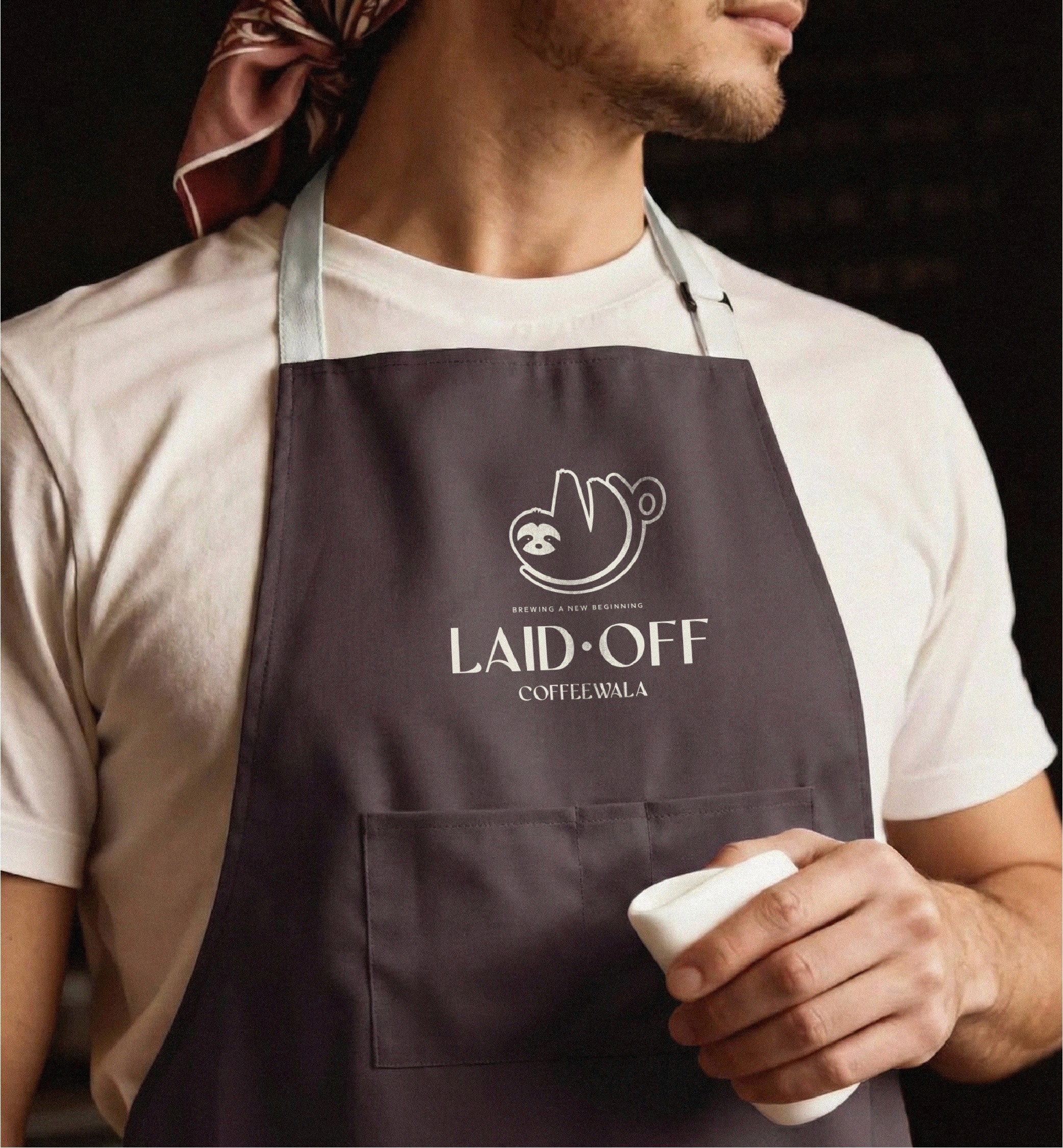


Execution
Execution
Applied across packaging, merchandise, social content, and campaign series. Lines like “We were data-driven right off a cliff” and “The Year of Efficiency: Lean, mean, morally obscene” anchor the voice.
The result is a brand that functions both as product and protest.
Applied across packaging, merchandise, social content, and campaign series. Lines like “We were data-driven right off a cliff” and “The Year of Efficiency: Lean, mean, morally obscene” anchor the voice.
The result is a brand that functions both as product and protest.


up next up next

COLLAB?
BET.
BASED IN blr,
india
Creative Director
Visual Visionary
COLLAB?
BET.
BASED IN blr,
india
Creative Director
Visual Visionary
COLLAB?
BET.
COLLAB?
BET.
BASED IN blr,
india
Creative Director
Visual Visionary